— 2020
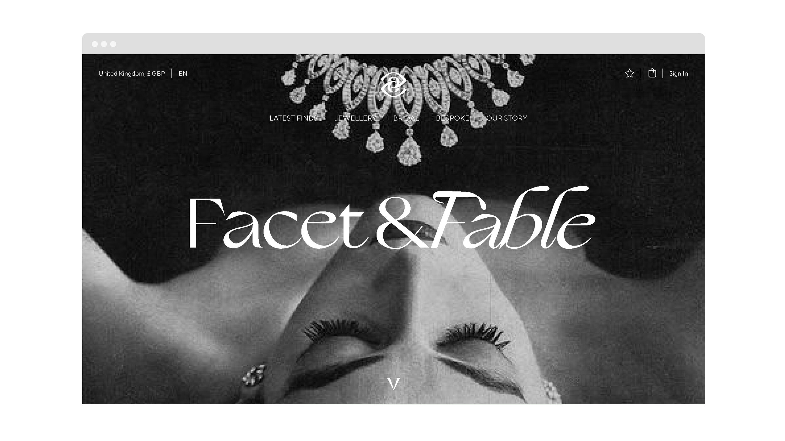
Vintage Jewellery Brand.
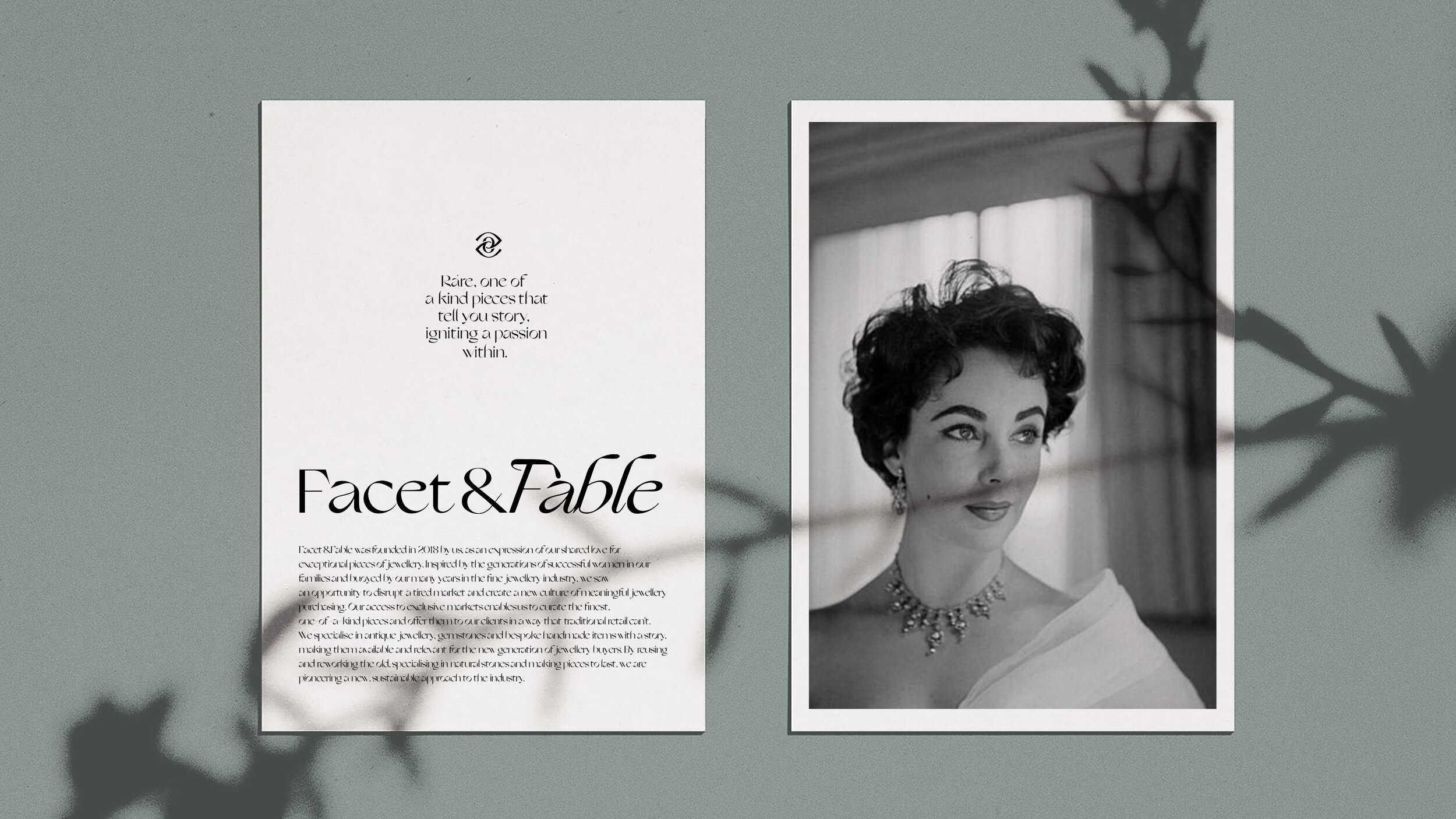
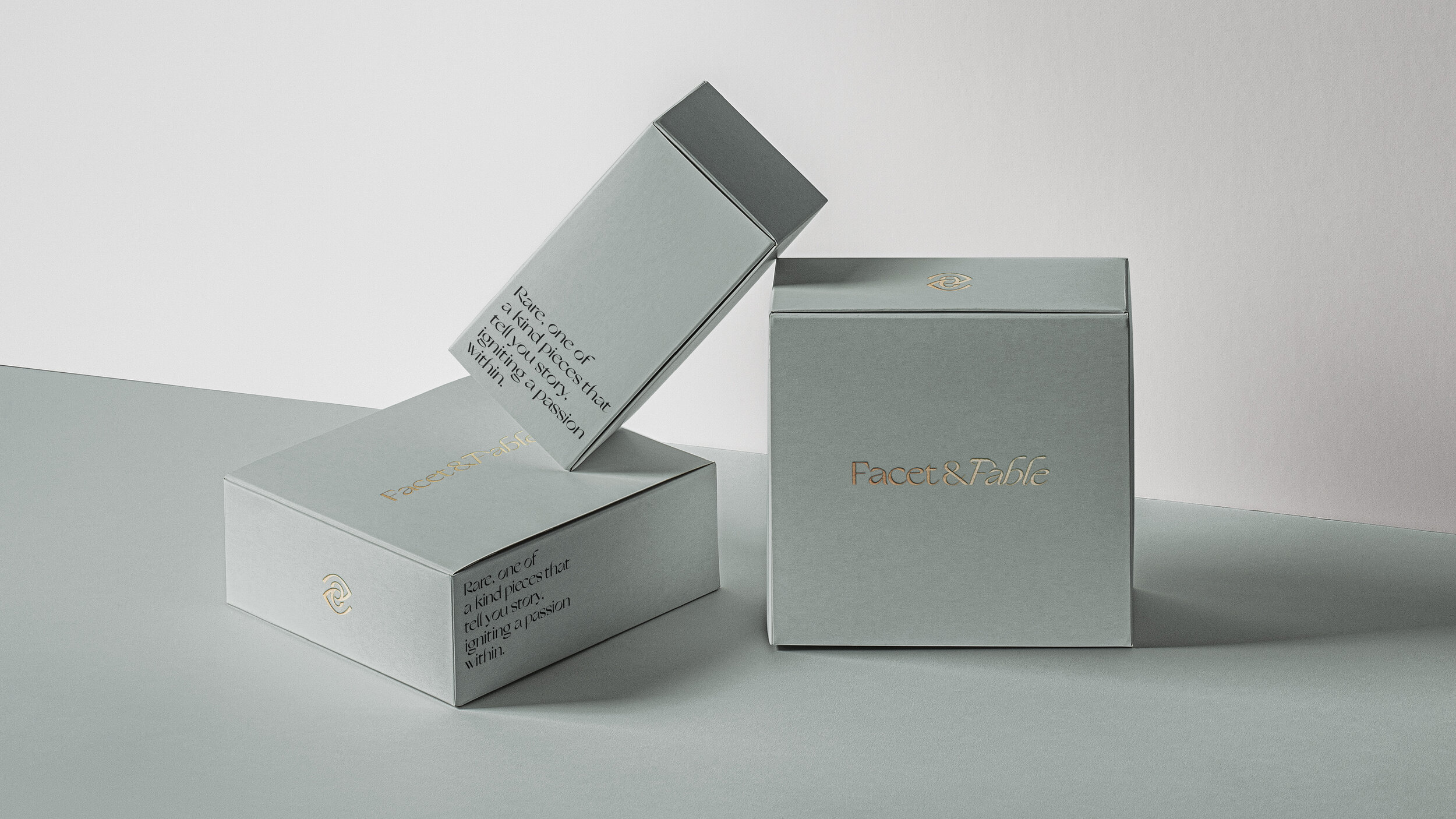
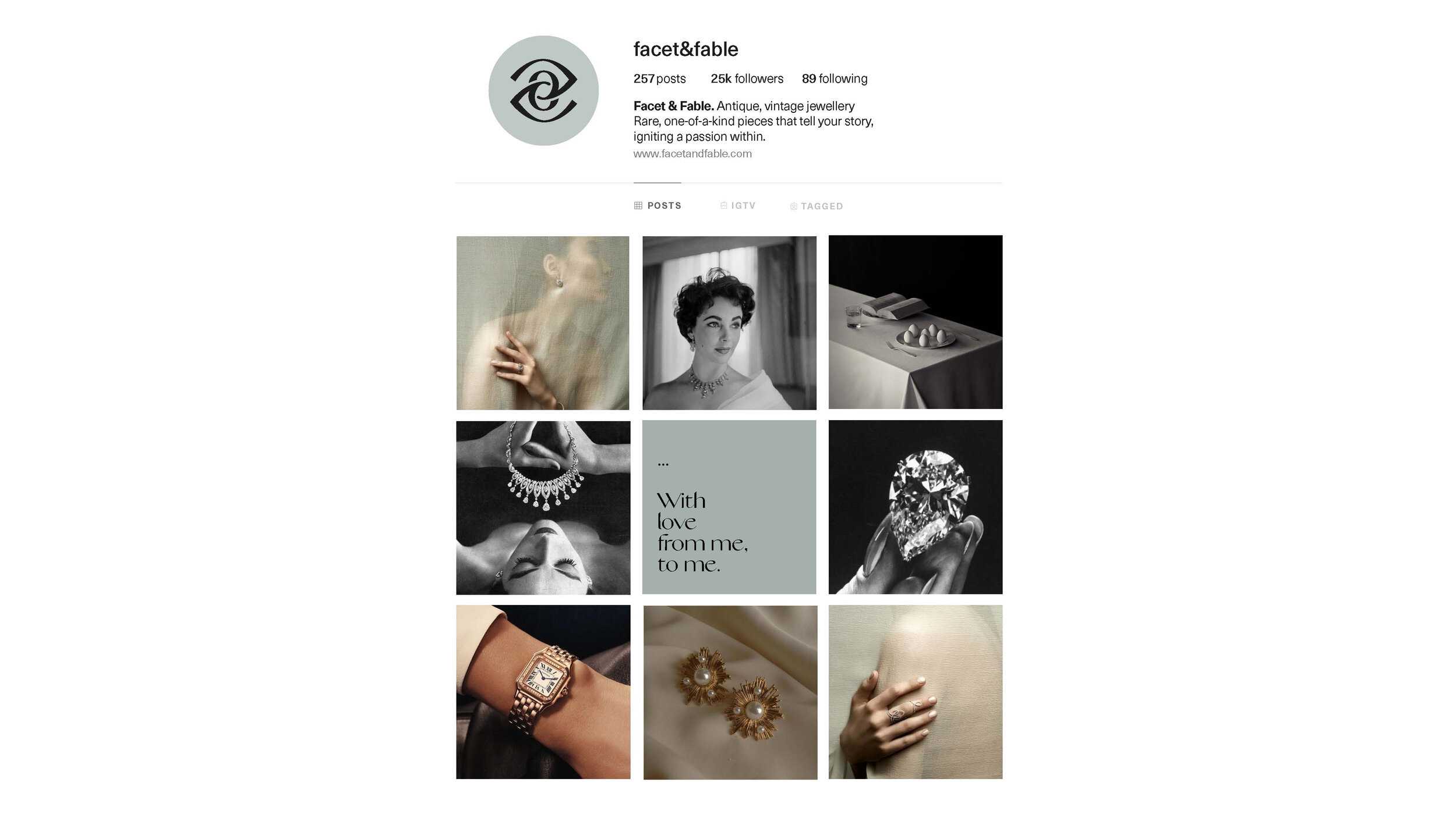
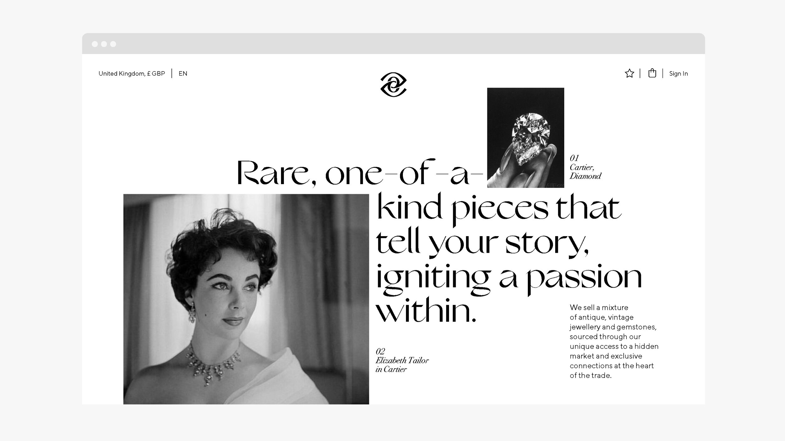
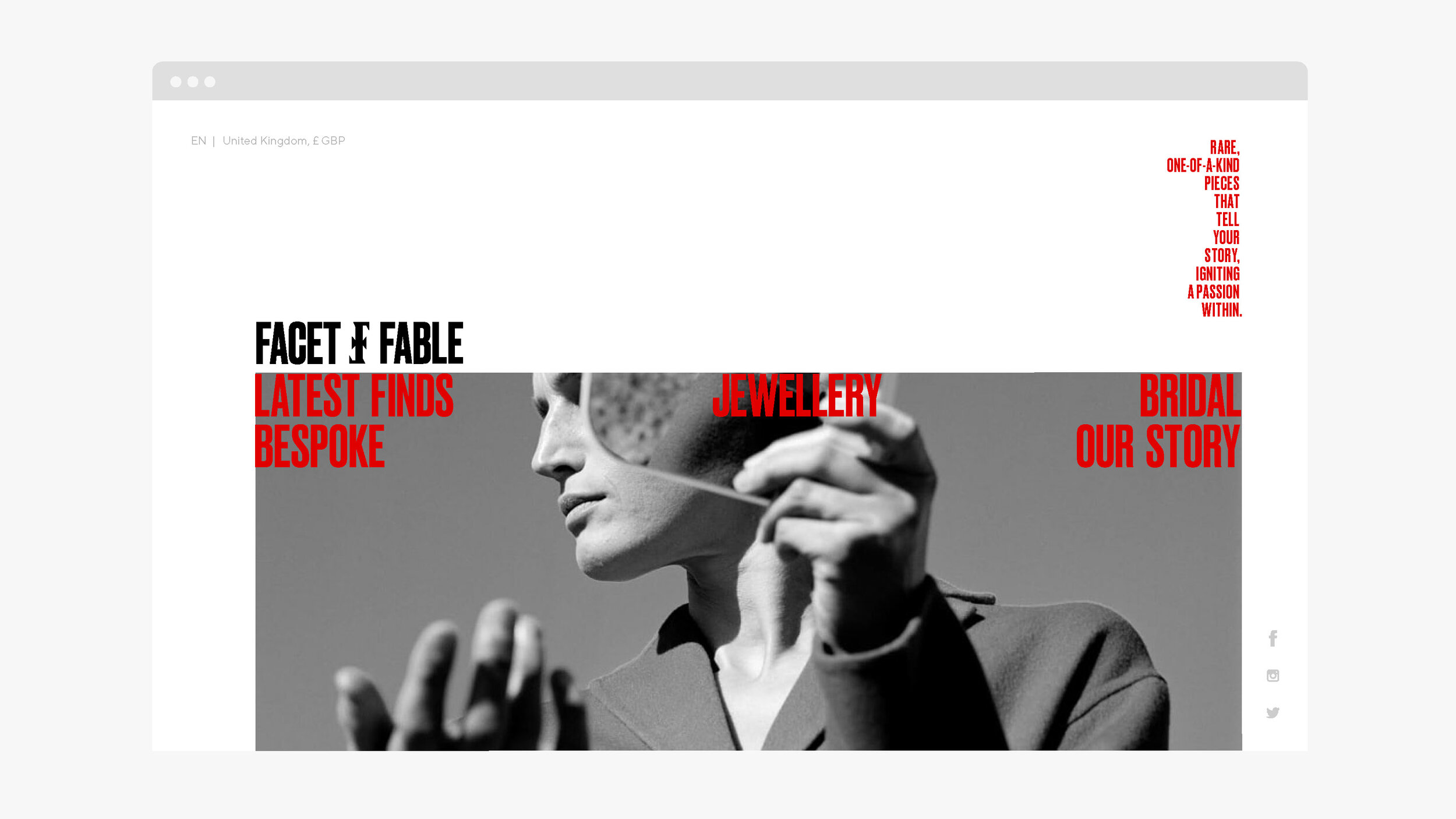
Rare, one-of-a-kind pieces that
tell your story.

Concepts.
Even though these concepts were not chosen in the end, this is a good example how ideas are usually presented to the client and how with graphic design you can achieve different looks&feels.
Concept 1.
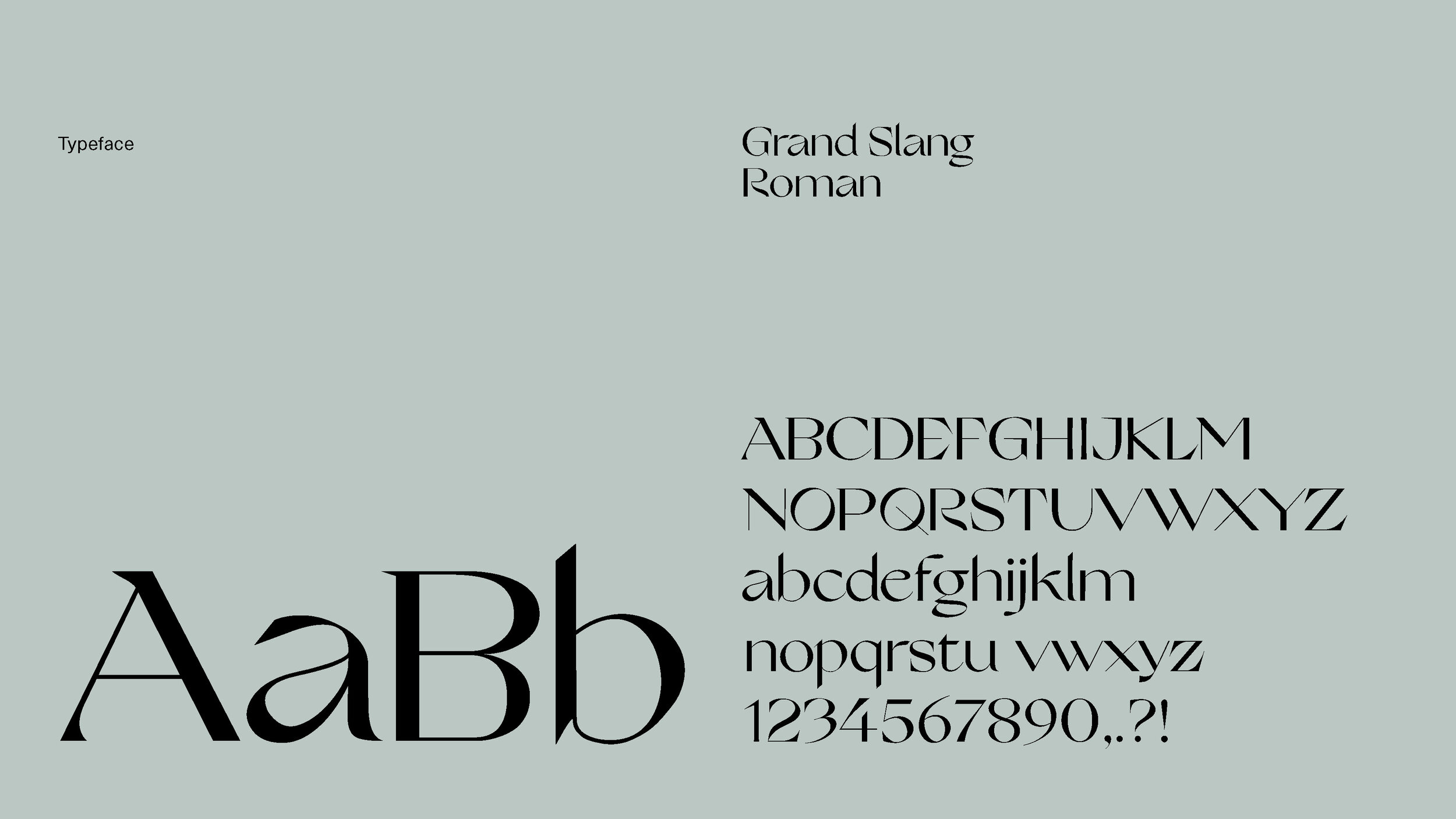
This route considers the individuality of each piece in the collection and the story they tell. It is and identity that reinvents old typographic ideas and compositions in a modern way, with a beautiful, sleek typeface that nods to mid-20th century calligraphy. An interpretation that also reflects the essence of the brand — giving a second life to vintage jewellery.
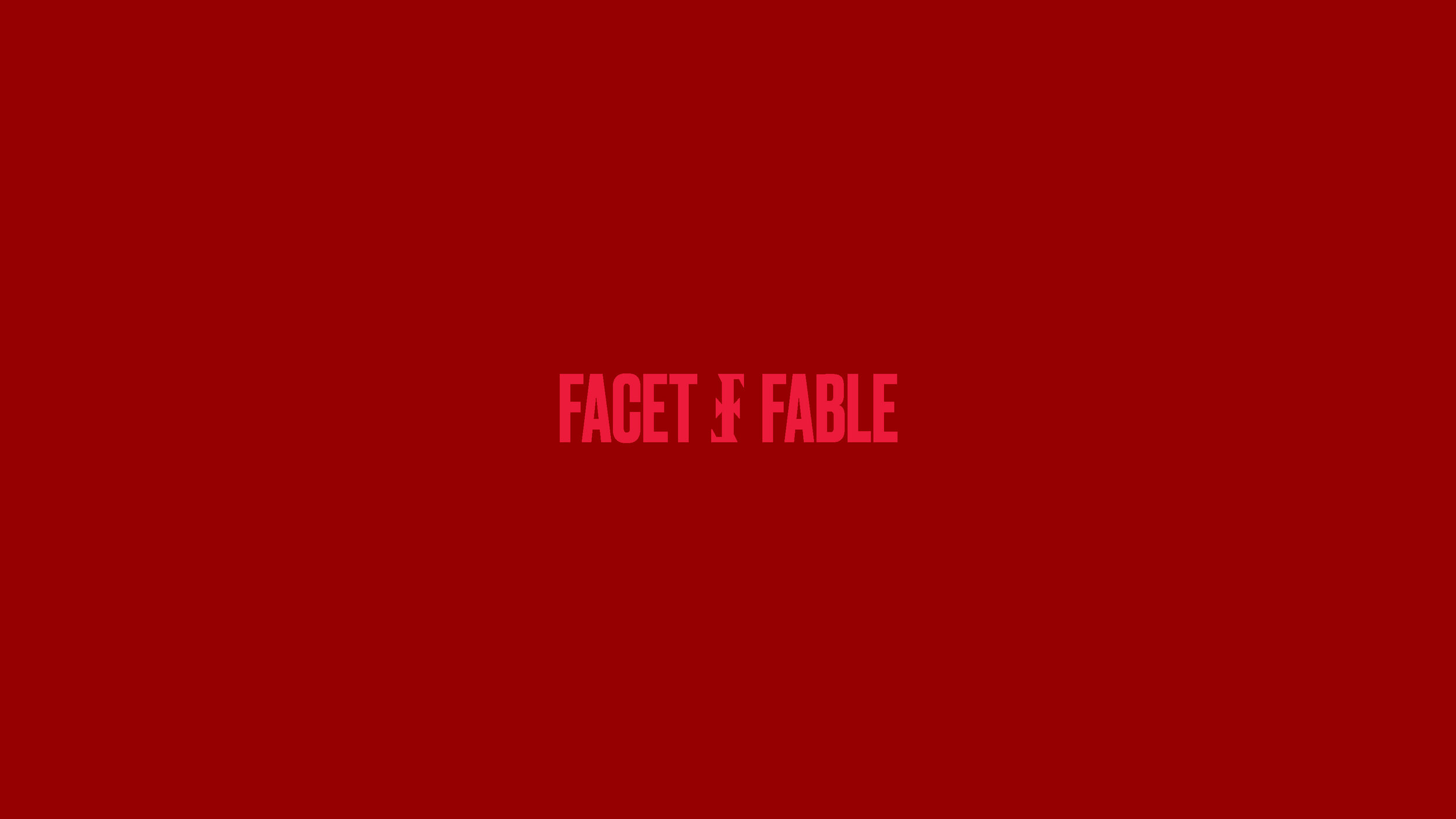
Concept 2.
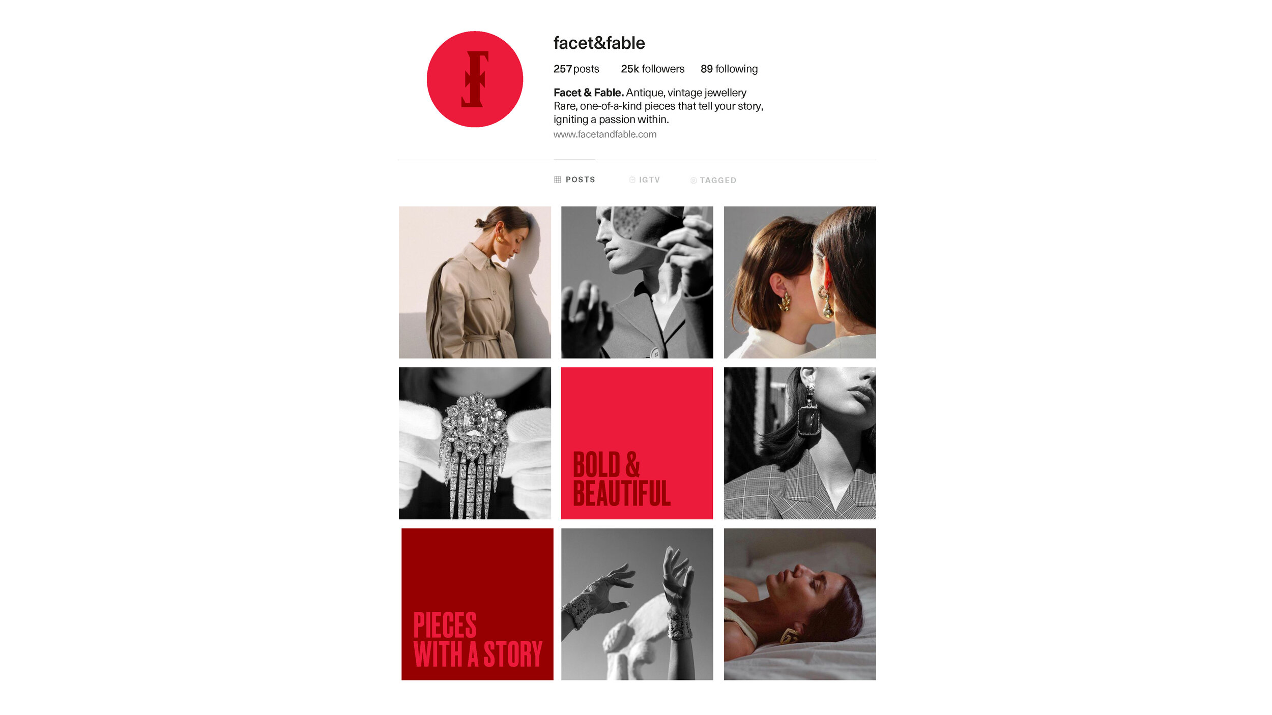
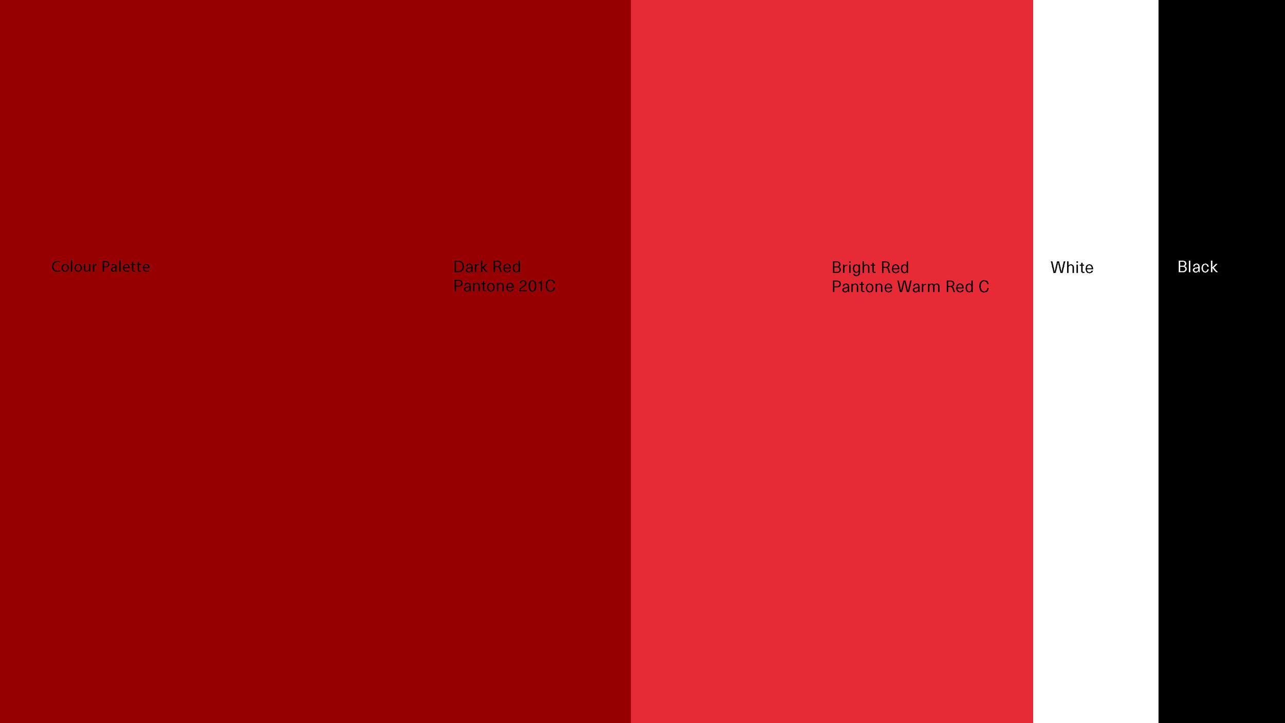
This concept goes above and beyond traditional expectations of what a jewellery brand can be. With a colour palette featuring two shades of red and a typographic approach, we’ve created a bold typographic language. One that truly pushes the boundaries, reflecting the brand’s DNA of being new and modern. All while also nodding towards the historical side, with a logo holding an icon that feels both contemporary and classic - resembling a piece of jewellery in itself.